

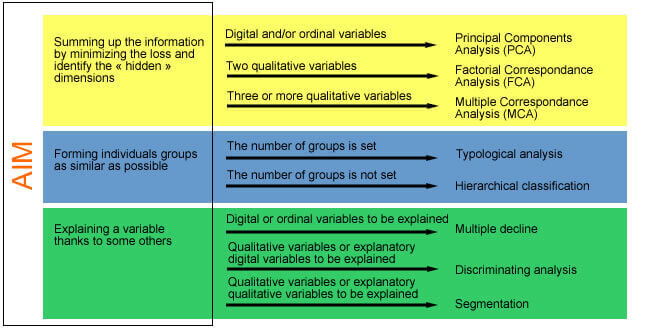
The multi-varied analysis covers a set of methods aimed to summarize the information coming from several variables, in order to explain it in a better way. There are two huge categories of methods: the descriptive methods and the explanatory methods.
The descriptive methods
These methods try to structure and simplify data coming from several variables without particularly favoring one of them. The most used methods in the surveys treatment are:
- The principal component analysis (PCA)
- The factorial correspondence analysis (FCA)
- The multiple correspondence analysis (MCA)
- The typology and classification methods
The choice of one or another method depends on the pursued goals and on the kind of data to be analyzed. Stated methods are detailed in the next pages.
The principal component analysis
The PCA covers a set of digital variables. It enables to position
individuals on a two-dimensional plan, according to the proximity of
their answers to chosen questions. Variables are also represented on the
mapping, but in an independent way from the individuals-points.
The PCA enables to highlight the answers structure by showing the
individuals group according to answers combinations to the chosen
questions.
The mapping axis usually do not match with one or another variable but
with an optimal group of several variables (ex: income and study level
can be a part of an axis starting in a way where they really can be
correlated).
PCA is really useful when we work on a statistical limited and
identified set of individuals.
So, if we want to analyze sales points according to different digital
criteria (surface area, employees, turnover, sold pieces number…), the
PCA enables to obtain an interesting map that join sales points
according all retained criteria and that also enables to categorize them
and especially to identify the nonstandard cases (ex: important surface
area with many employees but low turnover…).
The start table of the PCA contains online individuals and variables in
the rows, with, for each case, the digital response of the individual to
the matching question. Ordinal qualitative questions, the ones for which
answers can be ordinal organized between them (scales, frequencies…) can
be codified again in order to enter the PCA table. This recodification
must be prepared in advance. However, some statistical analysis software
such as STAT’Mania enable to make this recodification in live, during
the choice of the variables that should enter the PCA. The PCA algorithm
performs some different operations on the individuals/variables matrix
(data adjusting-decrease, diagonal of the matrix, extraction of the data
and vectors…) in order to go from the initial number of variables to a
small number of variables obtained by the combination with the first
ones.
These new elements constitute the mapping axis. The first element is the
one which summarize well contained information in the table. The second
element brings an inferior percentage but with complementary
information, and so on.
The PCA mapping firstly represents the first element (the horizontal
axis) and the second one (the vertical axis). Sum of explanation
percentages of the two elements tells us about the information loss rate
from basis data. So, the first element sums up 62% of the table and the
second one sums up 21%. The represented information on the mapping has a
rate of 83%. The “lost” information actually is 17%.
The individuals-points are represented on the mapping according to their
contact details on the factors. A priori, the close points are
individuals with close profiles, according to the answers to the chosen
variables in the analysis.
The variables-points also are represented on the mapping, but completely
independent from the individuals.
Their representation shows the correlation with factors inside a 1
radius circle defined with an arbitrary scale (that can be changed as we
want without affecting the individuals-points representation).
These variables-points tell us about the sense to give to the axes. So,
a variable close to the correlation circle (high correlation) and close
to an axis contributes a lot to the start of this axis.
Inter-variables angles (from the origin) tell us about correlation
between them. So, two variables that form a small angle are highly
correlated while a right angle would mean that they are independents.
Choosing a multi-varied analysis method
Different multi-varied analysis methods enable to answer to multiple
problems. The choice of one method depends on the initial objective, on
the manipulated variables types but also on the obtained results form
that can be more or less easy to present and to explain.
In order to intuitively understand
The multi-varied analysis tries to sum up the data coming from several
variables by minimizing the loss of information. In order to understand
well what it means, let us take the example of PCA that is applicable on
three digital variables or more.
When we have two digital variables, for instance the age and the size,
it is easy to imagine a graphical representation that reproduces all the
information: a two axes graphic, one for the age and the other for the
size, and a position of each individual-point according to her values
for each of the two variables.
If we add a third variable, for instance the number of children, we
would need a three dimensions graphic, which is more difficult to
read.
By adding a fourth variable, for instance the income, we pass the limits
of what the human brain is able to visually comprehend.
An analysis such as the PCA brings the points cloud in three, four or n
dimensions to a two dimensions plan.
However, the chose axes do not match to one or another variable but are
virtual axes coming from combinations between variables and calculated
to move as closer as possible from all the cloud points. Each point is
rejected on this plan. The combination of distances of each points
compared to the determined plan corresponds with the volume of lost
information.
The multi-varied analyses have a set of indicators that enable to
determine this level of missing information and to decide the relevance
or not of the obtained results and the necessity of deepen the analysis
by using complementary digital tables and displays of data on other
angles.
So, if the two first axes of a PCA do not five a crushing part of the
information, it is needed to get interested in the additional
information given by the third axis. For that, we can ask to display the
plan formed by the 1 and 3 axes and the one of the 2 and 3 axes. We can
also read details of the different points for the different axes in the
table in order to find eventual important gaps (two points side by side
on the main plan can be actually far from each other).
How to read a PCA ?
Below explanations come from a PCA realized with the STAT’Mania software. The example is about an analysis of a number of criteria about stores located in several towns. Successive questions to ask are:
How many axes are interesting for our analysis?
To answer this question, we need to consult the table of the eigenvalues,
wich always come with the PCA.
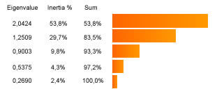
There are two different ways to determine the number of axes to take into account:
- An “absolute” criterion: only keep axes with eigenvalues that are
superior to 1 (this is the Kaiser case).
- A “relative” criterion: only keep eigenvalues that “prevail” on
the others by referring to the screeplot of the values.
It is necessary that the retained eigenvalues reproduce a “good proportion” of the analysis. This means that the sum of the inertia explained by each axis (3 columns) represents an important part of the total inertia. This sum is a measurement of the reliability of the mappings reading and so, of the global explanatory quality of the analysis.
In what points are we interested ?
The most interesting points usually are those that are close enough to
one of the axes and far enough from the origin. These points are well
correlated to this axis and are the explanatory points for the axis:
these are the most “speaking” points; their “real distance” from the
origin is well represented on the factorial plan.
In the below mapping, we clearly see that Nice is extremely correlated
to the horizontal axis. Likewise, Paris and Reims are particularly well
correlated to the vertical axis. The correlation of each point on an
axis expresses the representation quality of the point on the axis. It
takes values between 0 (not correlated at all) and 1 (highly
correlated). If this value is close to 1, the point is well represented
on the axis.
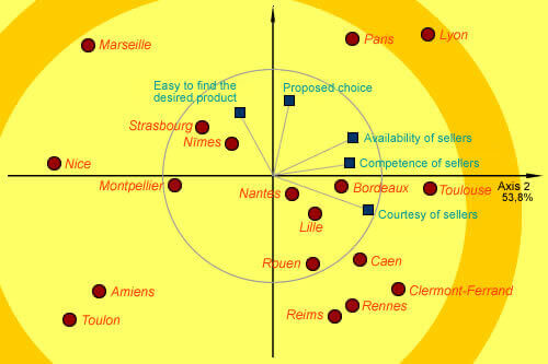
Points located near the center usually are badly represented by the factorial plan. Their reading cannot be faithfully made.
How to interpret proximities ?
We essentially are interested in well represented points (i.e. located far from the center). Whether two points are close to each other, it is possible that the individuals’ answers that they represent are really similar. However, we need to be careful: it is possible that they are really close on an axis while they will be really far on another one. We must look at them compared to all axes that were retained for the analysis. Whether they are well correlated to the axis that shows them the closest, we can conclude that they are really close.
Can we give a “real” sense to mapping axes ?
Factorial axes are virtual axes coming from a synthesis between the
variables of the analysis. They not necessarily have a precise sense
even if we can often find them a sense with the help of the variables
representation on the correlation circle. Do not forget that the
representation of this circle and of the variables on the PCA mapping is
made according to an arbitrary scale, which involves that the
variables-points proximity compared to the individuals-points does not
make any sense.
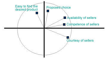
In our example, we can notice that “availability”, “competence” and
“courtesy” points are really close to the correlation circle and so,
well represented on the mapping. The almost closed angle (going from the
origin) that is formed by the “competence” and “availability” points
indicates that these 2 variables are quite well correlated to each
other. However, the almost right angle formed by “competence” and
“choice” indicates that these 2 variables are independents to each
other.
The fact that “competence” is close to the 1 axis tells that it is
really well represented by this axis. Because it is really far from the
2 axis, we can conclude that it is not much represented by this
axis.
Concerning the 2 axis, the “choice” point is really well correlated to
the axis. The “facility” point is also well correlated but in a fewer
measurement.
From these observations, we can conclude that the 1 axis rather matches
with the appreciation of sellers and especially of their competences
whereas the 2 axis rather matches with the appreciation of the store and
especially of the choice that it proposes.
By summarizing the information coming from the 5 analyzed variables, our
mapping shows us that there are a lot of efforts to do concerning the
welcoming and the information for the customers in the stores in Nice,
Marseille, Amiens and Toulon. Toulon is also few liked in terms of
choices.
Stores of Paris, Lyon and Marseille are liked by the customers for the
choice they offer and the facility to find the wished products.
Lyon distinguishes itself with the kindness of the employees and can be
considered as the best store within those that were analyzed. These
conclusions are confirmed by the examination of the correlations tables
and the individuals’ details, given by the analysis software.